
When it comes to tying the knot, your stationery is a special part of your wedding journey. After all, your save the dates are what set the all-important tone for your big day. Followed by the invitations, table plans, menus, place names and thank you cards – all which serve as a different chapter in your wedding story. The secret to telling a truly beautiful tale from start to finish? Choosing a cohesive colour palette that equals love at first sight. Scroll on for a spectrum of designs in shades that will work (and wow) whatever the season.
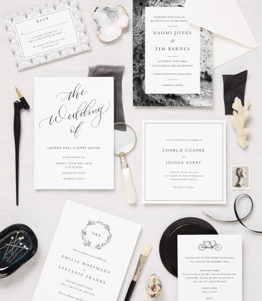
Timeless Monochrome
If ever in doubt, go black and white. This iconic colour combination has stood the test of time for a reason – it’s your shortcut to setting a chic, classic tone. Bring it into the 21st century with marbled prints and modern calligraphy.
Good for:
Formal weddings at grand venues, or putting a smart spin on contemporary, laid-back ceremonies.
Papier Tip:
Scatter a few natural objects amongst monochrome menu and place names to bring interesting textures to this sleek, polished look.
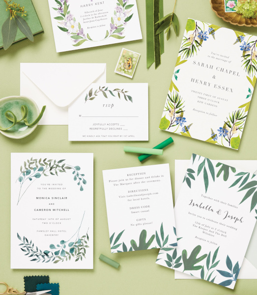
Fresh Greenery
From olive and pine to sage and a hint of mint, lush colourways lend an air of natural beauty to the occasion every time. Of course, they’re perfect for outdoor weddings where botanicals will play a large part, but they’re also a clever way to bring a sense of the great outdoors to weddings in cool, stark indoor venues.
Good for:
Making people feel relaxed. Fresh, tranquil colourways will do that to you.
Papier tip:
Play on the au naturel vibes by incorporating real foliage into your wedding favours or table settings.
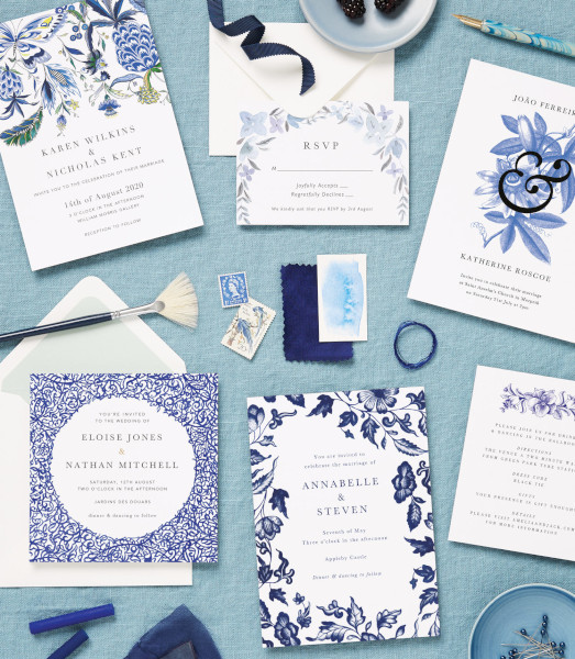
Something Blue
Borrow your ‘something blue’ from these designs for cool, breezy feel to your big day. From deep ocean tones to gentle sky blues, there’s a shade to match every wedding colour scheme on this soothing colour spectrum.
Good for:
Tapping into a fresh yet luxurious mood.
Papier tip:
Handwriting your invitations? Use a calligraphy pen with blue ink to match your designs.
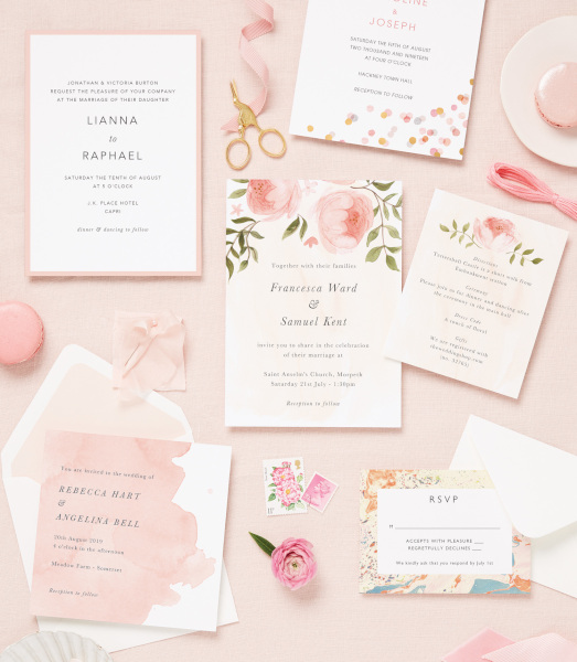
Blushing Pink
Spread the love with exceedingly pretty save the dates, invitation sets and on the day details. Soft, pastel blush tones are on-trend and forever romantic at once. And whether it’s pared-back borders, sweeping brushstrokes or charming floral prints, we think you’ll agree practically everything looks good in pink.
Good for:
Summer weddings at dusk or shaking up the rules for a winter wedding.
Papier tip:
Don’t stop at stationery – pink petals and macarons will sweeten up your table settings.
Ready to find your perfect colour match? Shop the entire Wedding Collection from Papier here.
![]()